Forecast Accuracy Dashboard
See how closely your demand forecasts have matched real sales — over time and product by product.
Can I trust the forecast?
The Forecast Accuracy dashboard answers exactly that. Open it from the Accuracy link on the Demand Forecast page, and you'll see how closely BakeOnyx's predictions have tracked your real sales.
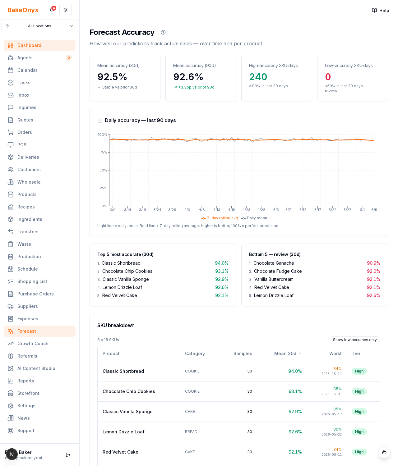
The headline cards
- Mean accuracy over the last 30 and 90 days
- Counts of high-accuracy and low-accuracy product-days
- A trend showing whether accuracy is improving, stable, or slipping
The accuracy chart
A daily accuracy line over the last 90 days, with a 7-day rolling average laid on top so you can see the real trend through the day-to-day noise.
Best and worst performers
The dashboard highlights the top 5 most accurate products and the bottom 5 that need review, plus a per-product table with 30-day and 90-day error (MAPE), how many forecasts were made, and the single worst miss.
How to use it
If a product sits at the bottom of the list, check whether its sales are genuinely erratic — events, weather, one-off bulk orders — or whether its history is simply thin. The forecast improves as it learns from more real sales, so accuracy naturally climbs over your first few weeks of use.